By Marion Siebert, originally published in SBAM’s May/June 2023 issue of Focus magazine
When designing your website and digital applications, it’s easy to get lost in things like visually pleasing aesthetics and billboard-worthy branding. After all, these are critical components to building an effective user experience. However, not all users consume content the same way, and providing experiences that take accessibility into account can have a major impact on your business. At its most basic level, web accessibility (often called digital accessibility) is intended to make all digital content easily accessible to everyone, specifically those with disabilities.
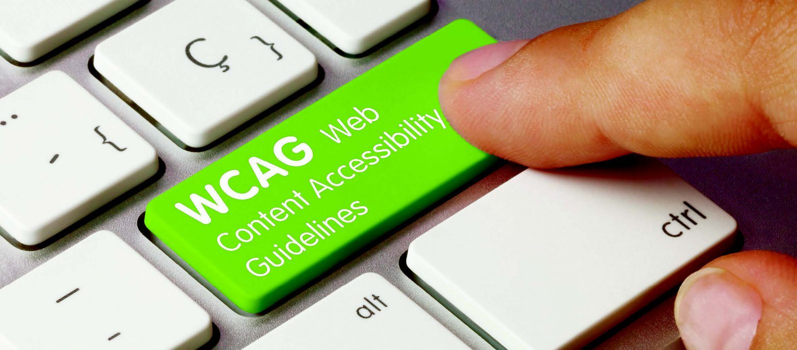
Not only is it important for businesses of all sizes to follow current web accessibility guidelines, it’s also required by law in the United States as part of the Americans with Disabilities Act (ADA) and the Web Content Accessibility Guidelines (WCAG) established by the World Wide Web Consortium (W3C). Lawsuits over digital accessibility are on the rise, and it’s predicted that this will continue, which is not surprising given that 26 percent of adults in the United States are living with a disability, according to the Centers for Disease Control and Prevention (CDC).
Legal issues aside, there are other beneficial reasons for business leaders to make the move toward web accessibility, including accountability on Diversity, Equity, and Inclusion (DEI) initiatives and improved search engine optimization (SEO).
While incorporating accessibility standards into your existing digital assets can be costly, there are several steps you can take on your own to get started. This will help to ensure that all your users, regardless of their abilities, can easily navigate and consume the information you share.
Test Your Site for Accessibility
It’s not uncommon for business owners to have no idea whether their website is accessible or not.
Spoiler alert: It’s probably not.
In fact, as of 2022, a report from WebAIM found that just three percent of the internet is accessible to those with disabilities. Thankfully, there are tools that can easily help you get to the bottom of it. For one, the WAVE Web Accessibility Evaluation Tool can test your website for issues by identifying accessibility and WCAG errors. It won’t catch every fine detail that falls under the accessibility umbrella, but with its laser focus on the most common issues that impact end users, it’s a great place to start. You can then use the results to begin addressing the most pressing issues.
Keep Your Content Clear and Concise
Most people don’t visit a B2B or B2C website for its thought-provoking prose. All of the messaging across your digital assets should be direct, clear and concise. Avoid using fluff, filler or jargon, which will not only frustrate most users but also make it challenging for non-native speakers and those with cognitive difficulties and learning disabilities.
Make it Easy to See and Hear
Images are a critical component of your website, but if they don’t contain alternative text (alt text), they can be meaningless to those who are visually impaired. Providing alt text for images allows people who use screen readers to have context attached to the image. This text should be concise and descriptive, and it should provide the exact same information as the image. Screen readers and other assistive technologies usually stop reading alt text at 125 characters, so be sure to keep things brief (you can think of this like writing a short social media post). As an added bonus, alt text is also used by search engines like Google to understand the image’s content, which can help your website’s SEO.
For visually impaired users, it’s also important to make sure all of your visual elements and text are high-contrast, which makes the text on your pages easier to read. When incorporating audio accessibility to your site for those who are deaf or hard of hearing, make sure to include captions (preferably with the option to toggle on or off), transcripts and volume controls on video content.
Don’t Forget to Simplify Your Navigation
Some users cannot work with a mouse or pointing device and rely exclusively on the keyboard to navigate between pages and click buttons or links, so you should ensure this is possible on your site. While we’re on the topic, it’s also important to use descriptive link text, which provides context for the destination of the link. Instead of “Learn More” or “Click Here,” include the name of the destination landing page. For example, if the link navigates to the SBAM member login page, it would say, “link SBAM member login.” This allows users to understand exactly where they’re headed (and they’ll be more likely to click!).
Work With an Experienced Developer
While there are several initial steps you can take on your own to start getting your digital assets up to snuff, accessibility involves numerous moving parts. Some technical examples require coding knowledge, ongoing maintenance and regular updates to align with current standards and best practices. To this end, it can be well worth allocating resources toward working with an experienced developer highly versed in accessibility.